

...Beige! There have been improvements outside, but not of the magnificently photogenic kind. The foundations have got deeper, the trench for drainage, electrics etc has been dug but we have not yet got the foundations done - which we had hoped to have had completed by now. The 2.5 - 3 week estimate for the completion of the project has now changed into 3 - 4 weeks.
So, now that the worst of the dirt, clay and rubble has been through the house I decided to try a couple of sample pots on the walls. We had already factored into our budget the likely-hood that we would probably have to repaint the downstairs after the work.


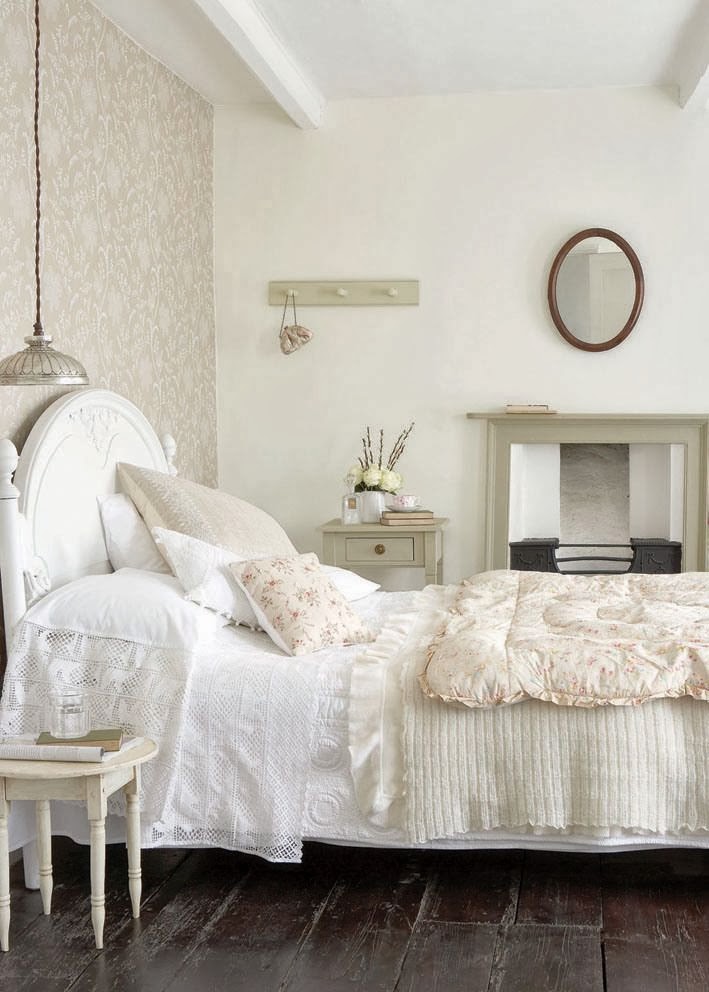
After seeing images of dining rooms and sitting rooms with lovely dusky plaster coloured paint I was quite keen to go for one of these, but my husband's reponse that it looked very "pink" made me think again. He puts up with a lot of floral and feminine stuff in the house already, a pink sitting room or dining room might be a step too far! So I'm now currently pondering over either a light off-white shade (Stock from Little Greene Paint Co) or quite a bright white with a hint of light blue (Starling's Egg from Little Greene Paint Co). We used Stock in the kitchen and Starling's Egg in our bedroom.


Then for the dining room, I saw the photo below and the large fireplace reminded me of our dining room fireplace (which I had been thinking of painting for a while). So I whizzed down to my local Little Greene Paint stockist and picked up sample pots of Portland Stone Pale for the walls and Portland Stone Deep or Portland Stone Dark for the fireplace. But unfortunately these were all a shade too dark.
But I really like the idea of using a different shade of the wall colour on the fireplace instead of using the usual white. I picked up a Little Greene Colour Scales chart which I have been pouring over this weekend, I'm already looking at the China Clay and Slaked Lime scales for the dining room...looks like it may be rather more than fifty shades!
I'm in the process of picking wallpaper for our hallway... The fact that I have convinced my hubby to let us have wallpaper, is a feat not to go unrecognized, but when I favoured a floral design, I think it was a step too far and he finally put his foot down... I sometimes wish he just didn't have any opinion on our house, and let me just go and decorate it, at my own free will...
ReplyDeleteI adore neutrals . . . then you have the option of popping in a little color here and there or leaving it as in . . . it so tranquil :)
ReplyDeleteThanks for creating this very interesting post. We are having the inspection done on a little cottage tomorrow, and if all goes well, I'll be needing to paint and make it my own :)
Have a happy day and keep smiling.
Your blogging sister, Connie :)
This is a very interesting post. In our new small cottage, we have chosen Antique White throughout, it is a very popular colour in Australia. Apparently it suits the stark light in our country. Good luck with choosing colours.
ReplyDelete